


There is a huge section of the society that doesn’t know the rules and strategy of graphic designing in-depth. Hence, the text below will give an extensive guide of how to follow simple steps to an effective graphic design strategy.
1. Use Consistency While Designing
Although graphic design is all about creativity and innovation, nothing can work out without proper consistency. One of the first and the crucial steps of graphic designing strategy is to maintain ‘Consistency’ in terms of clarity of thoughts and ideas clearly. The idea formation and the concept behind each of the graphics should be consistently visible and should not leave its essence throughout the design.
Interaction design can be understood in simple (but not simplified) terms: it is the design of the interaction between users and products. Most often when people talk about interaction design, the products tend to be software products like apps or websites. The goal of interaction design is to create products that enable the user to achieve their objective(s) in the best way possible. You can hire interaction design firms to achieve desried results.
Consistency needs to be maintained throughout the design and various other materials, which helps the target audience is clearly recognizing the idea behind it. By being consistent with the designs, the company manages to reflect a strong brand image in front of the target audience.
To process through the path of consistency, one needs to be consistent with the following important things:
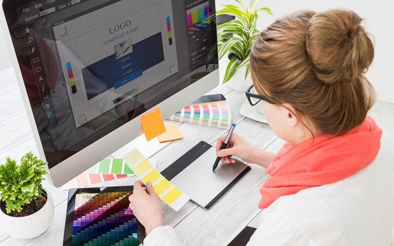
Color Palette
During the process of graphic designing and making different innovative designs, it is important to note that one should not use more than 5 colors, which includes shades as well. The ideal number of colors which one should use are 2-3 to make it look captivating and attractive.
Typography
While making designs, make sure not to use more than 3 fonts. Rather it is always advisable to stick to one font throughout to reflect consistency. It is vital to use similar kind of elements throughout. However, there is a difference between exactly the same and similar, and this should be kept in mind. A little variation here and there are important and needed to make the design look attractive. The basic idea is to make the entire design belong to a particular kind of series which follows one another in order.
2. Avoidance of Poor Legibility
Although there is less usage of fonts and more of pictures and graphics in the graphics which are made, still there is a certain amount of text which is required to be put in. Due to this, Legibility does play a very crucial role in both print and web designs. The reason why legibility is important because if the message is not visible, then the whole idea of passing or conveying the message loses its charm and essence. This will then lead to the loss of the audience, which can be a huge loss.
A lot of planning and plotting goes on to decide not only what needs to type but what kind of fonts need to be chosen, keeping in mind the target audience. The font, size, and color should be chosen in such a manner that it automatically in one go attracts and appeals to the audience. The age of the target audience plays a crucial role in deciding the kind of fonts and colors to be chosen. The overall aim is very simple to improve the overall experience of the users and keep them satisfied no matter what.
3. Focus on Avoiding Color Discord
Colors on graphic designing are the heart of the designs. Colors indeed, are a very powerful tool but can turn out to be evil if not used properly. It is very important to choose the colors which complement one other and don’t look odd: This is known as creating color discord. There are various color discording themes such as light-on-dark schemes, the shades of the same color, etc. which thoroughly complement each other and look stunning, which eventually leads to catching the eyes balls of the target customers.
Don’t Miss-
Most Famous 8 Graphic Design Tools and their Uses
5 Ways Great Graphics Help Your Business get a Boost
4. Establishment of a Visual Hierarchy
Throughout the process of graphic design, it is vital to maintain some sort of visual hierarchy. But what is the need? Visual hierarchy helps to understand the basic structure of the design right from the start and make a mental visual of how the design should actually look like.
What Exactly is a Visual Hierarchy?
A visual hierarchy is actually considered to be the use of color, a size that emphasizes one of the items over the other, and helps in drawing the attention of the viewers to a few specific items over the others. Visual hierarchy generally weights the different elements of designs as per its importance and makes sure to use the apt colors and sizes to draw to the eyes or making the eyes wander, whatever seems to be more suitable.
Without a proper visual hierarchy towards the viewer’s eye, it becomes difficult to understand undermine the actual order in which the information on the graphic design needs to be read. Hence, keeping it simple with having a clear visual hierarchy makes it as easy as ‘Easy peasy lemon squeezy.’
5. Embrace the Whitespaces
Who does not love white as a color? White is considered to be one of the most beautiful and classy colors. However, often graphic designers who are very new and raw to this domain get overwhelmed by the entire concept, and the only focus of theirs is to cram as many graphics on to the poster as possible to make it look heavy, filled, and leave no white spaces at all. However, in reality, the white spaces are like a breather and actually embrace the overall look of the poster or design.
This is one of the core graphic design rules which speaks about ‘Conserving the white spaces. Having more white spaces actually makes the entire design look more professional, subtle, and neat. It allows the viewers to actually have the space to focus on the important graphics and fonts and make mental notes of it. The viewers can’t try and cram the information which is placed on the poster, which eventually leads to distraction and viewers losing a tremendous amount of focus.


Leave a Reply