


Flyers play a vital role in terms of marketing because it acts as the medium of random announcement at times by just distributing the flyers to the public. Hence they comprise to be the important part of the marketing campaign. Choosing the right flyer font can go long way as it is immediately understandable and it can be the best business flyer design.
So here are few tips to select the fantastic flyer font.
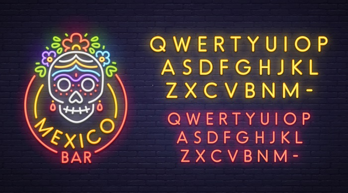
To Check The Images On The Design: this will help in visualisation of the things that will be included in the flyer design and gives the general idea on the look of the flyer. It allows the person to understand the character of the image on the design and make it more meaningful without causing any kind of confusions.
The Font Must Be Readable: flyers are more widely used in the marketing campaign. Hence, it should be legible immediately. As a general rule illegible fonts are considered up to some inches in the design. Flyer font balances many elements and factors to deliver the strong visual message which supports your flyer message. These flyers are been used to grow the business after all, and the fonts used for nightclub card design are definitely different from the flyers that are used to promote a daycare. Before sending the design for the print it is necessary to plan the size of the flyer because many designers fail to consider the factor that the small fonts are easy to read on the screen and is not same in the real world.
Create The Best Impression: your flyer font is the path to convey the message and how it is been received, cause your images and the copy of designs do much of your work. Hence, the message on the flyer is absolutely important and should be sensible. In terms of look and feel it is very required that the font should match everything else in the design and need not too contrast font size. A font should complement the design on the flyer. You should be very sure during the selection of typefaces as they help to deliver the feeling that your copy is going to represent.
So it is very important to consider how different elements lend themselves to the message that you want to convey. A flyer font must be necessarily unique and legible. So, pay attention towards the font that gains the attention of the passer-by people and equally makes you unique in the business.
Font Size Should Be Relevant To Brand: this is beyond the message that you want to communicate through the flyer as the brand’s overall goals are more worth and important than the copy of image used in the designs and the specific message that flyer communicates in the campaign. Using the irrelevant fonts would damage the brand. It very important to know about your brand thoroughly and hence, the choice flyer will be appropriate.
If the fonts are different there is no need to feature the flyers, different most always find their own ways to get noticed as most of the designers commonly use one-two fonts with different weight. Hence, the different fonts do not require any publicity.
There Should Not Be Price Constraint For The Right Font: there are no “ifs” or “buts” about investing in the right font. Truly few great fonts give the feel of huge investment in terms of specific knowledge and time. Even if it takes a little time by a designer to make a solid flyer, definitely he is well-versed in that field.
There are many factors that the flyer depends upon like the target audience, the subject of the flyer and the message it is promoting. Choosing a good font for the right flyer should not be way difficult. Instead of trying to match the right fonts, browse for the multiple different fonts and use the appropriate one. This method of searching the right font, ensure the efficiency of the flyer in the marketing campaign. So just drive the message that you want to communicate and make a powerful flyer and boost the response rates.


Leave a Reply